臺灣國際企業識別設計獎 Taiwan International CI Design Award
類別 Type:活動識別 (D類) Event Identity (Type D)
獎項 Prizes:優選 Distinction
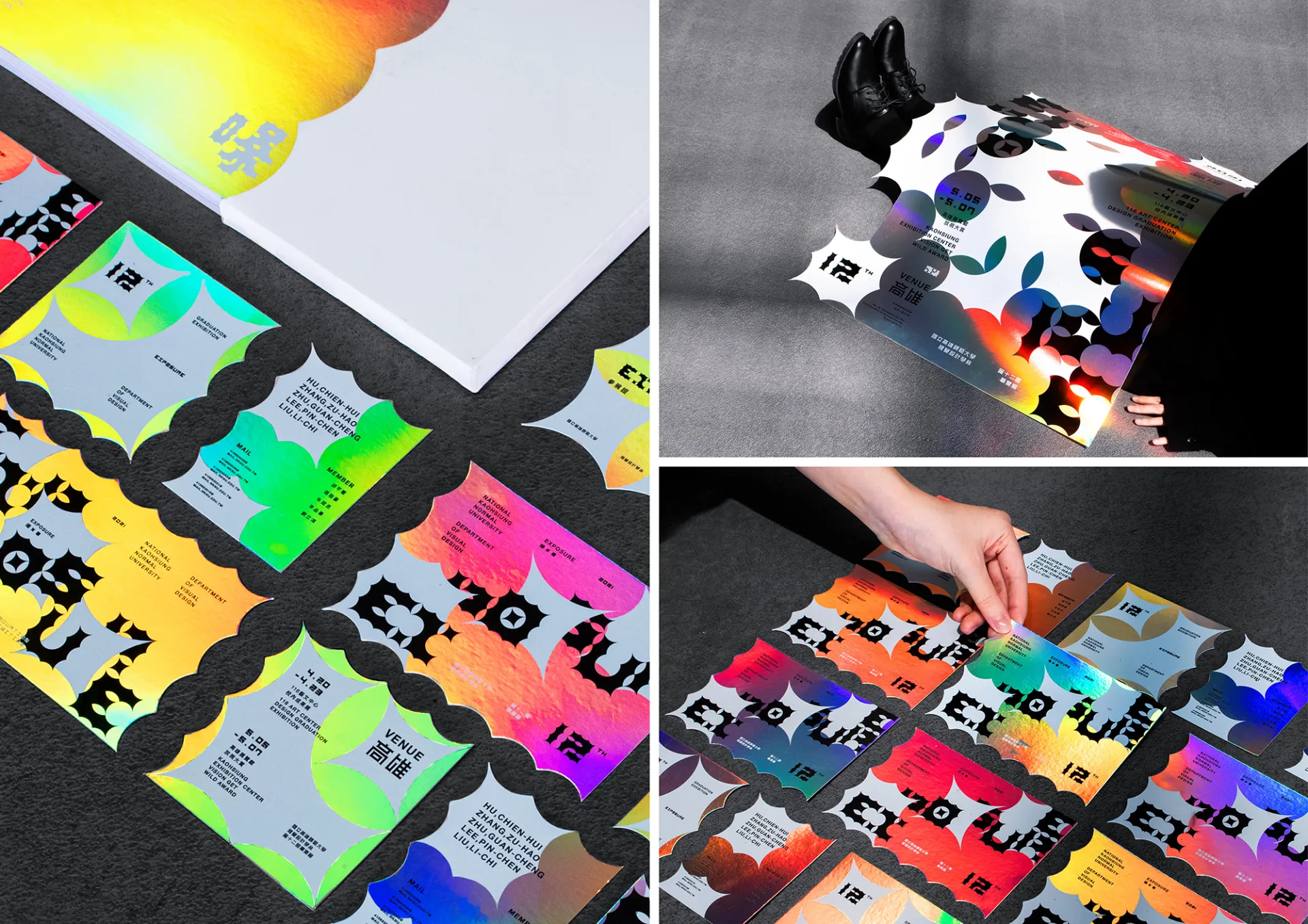
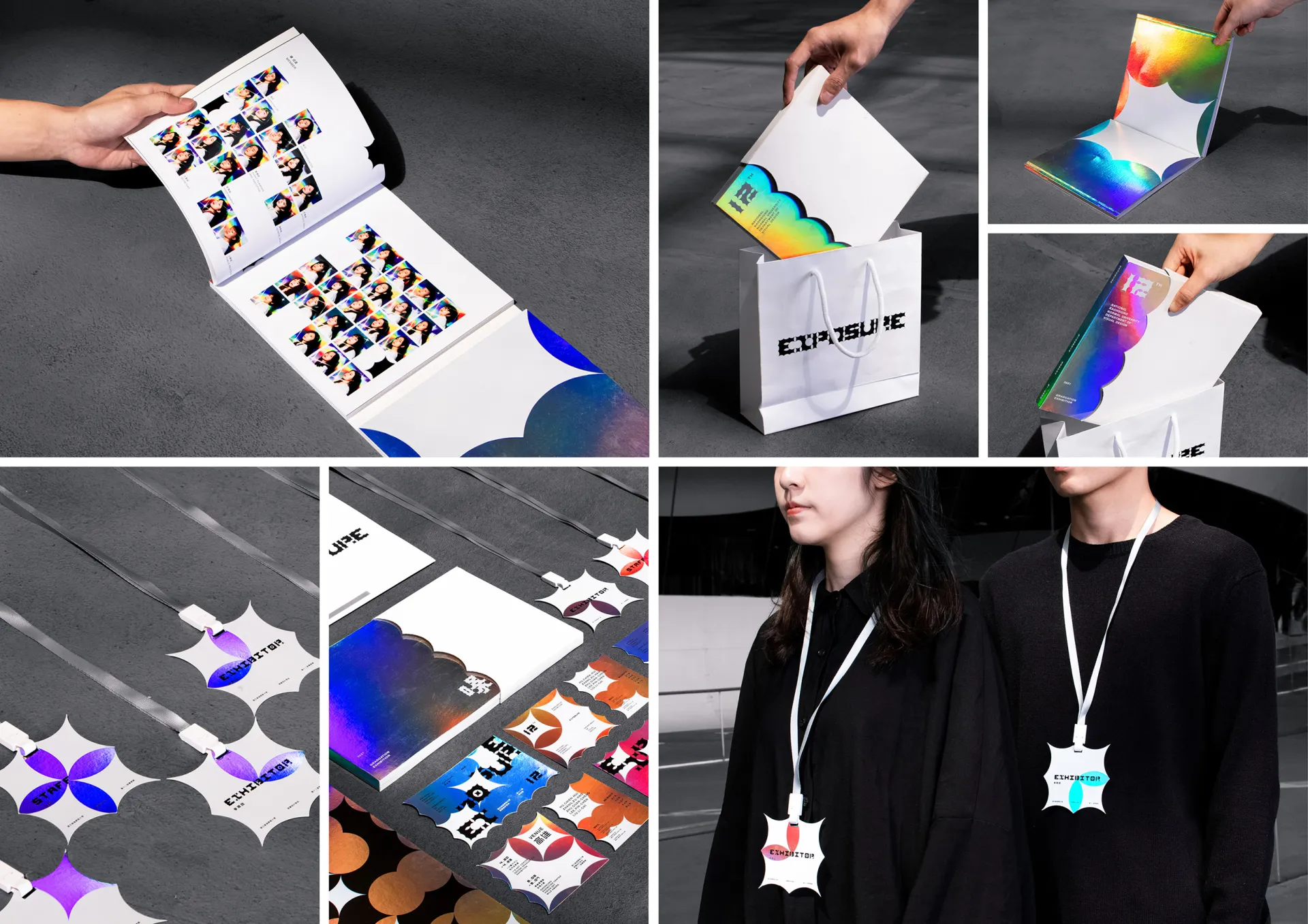
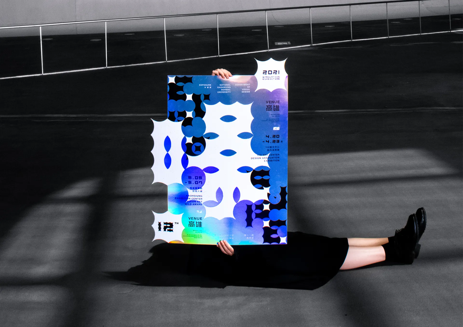
作品 Works Title:曝 EXPOSURE
設計師 Designer:國立高雄師範大學 視覺設計學系 第十二屆畢業展 形象組——張祖豪 ZHANG, ZU-HAO、胡芊慧 HU, CHIEN-HUI、劉立淇 LIU, LI-CHI、李品蓁 LI, PIN-CHEN、朱冠丞 ZHU, GUAN-CHENG
國家/地區 Country/Region:台灣 Taiwan
作品說明 Description:
「曝光之下,我們都將成為畫面中最耀眼的存在。」
「曝裡有光,光裡有彩,彩裡有我們」——以向四角突出的圖形作為基礎符碼,代表各個單一的組別,再進而將符碼含義與圖像作延伸變 化,結合成包括本次展覽四大類別(平面、多媒體、插畫、包裝)的新符碼,而當所有符碼組合,色光匯集,主視覺「曝」便將乍現光彩。
「曝」由色譜上各自獨立運行的粒子,也就是全體參展人,所結合而成。而這份耀眼,則有賴觀者的參與,才能夠盡情綻放異彩。因此, 在紙材選用上,鐳射紙依據觀看角度的不同即呈現色彩各異的特性,恰巧與本次展覽欲傳達之概念與期盼緊緊媒合——無論參展人、觀看者,與本次展覽,都是獨一無二、璀璨奪目的存在。
Under the exposure, we will be the most dazzling presence at the moment.
Under the exposure, there is light. In the light, there is color. Between the colors, there is us.
In this exhibition, the four artwork categories, graphic design, illustration design, multimedia design, and packaging design, are represented by four different symbols composed by the quadrilaterals with four protruding corners. When all symbols are assembled, the color lights are converged, and the main visual design glitters.
The word EXPOSURE is assembled by different colors in the spectrum, meaning every designer of this exhibition. In order to shine, participation from the viewers is needed. Therefore, the holographic paper is used to present different colors from different viewing angles, which implies the concept and the expectation of this exhibition: the designers, the viewers, and the exhibition itself are all their own unique and dazzling presences.