臺灣國際企業識別設計獎 Taiwan International CI Design Award
類別 Type:企業識別 (C類) Corporate Identity (Type C)
獎項 Prizes:優選 Distinction
作品 Works Title:肉次方燒肉放題 品牌識別
設計師 Designer:三名治股份有限公司——唐啟堯 Tang, Chi-Yao、黃俊堯 Huang, Chun-Yao、林建和 Lin, Jian-He
國家/地區 Country/Region:台灣 Taiwan
作品說明 Description:
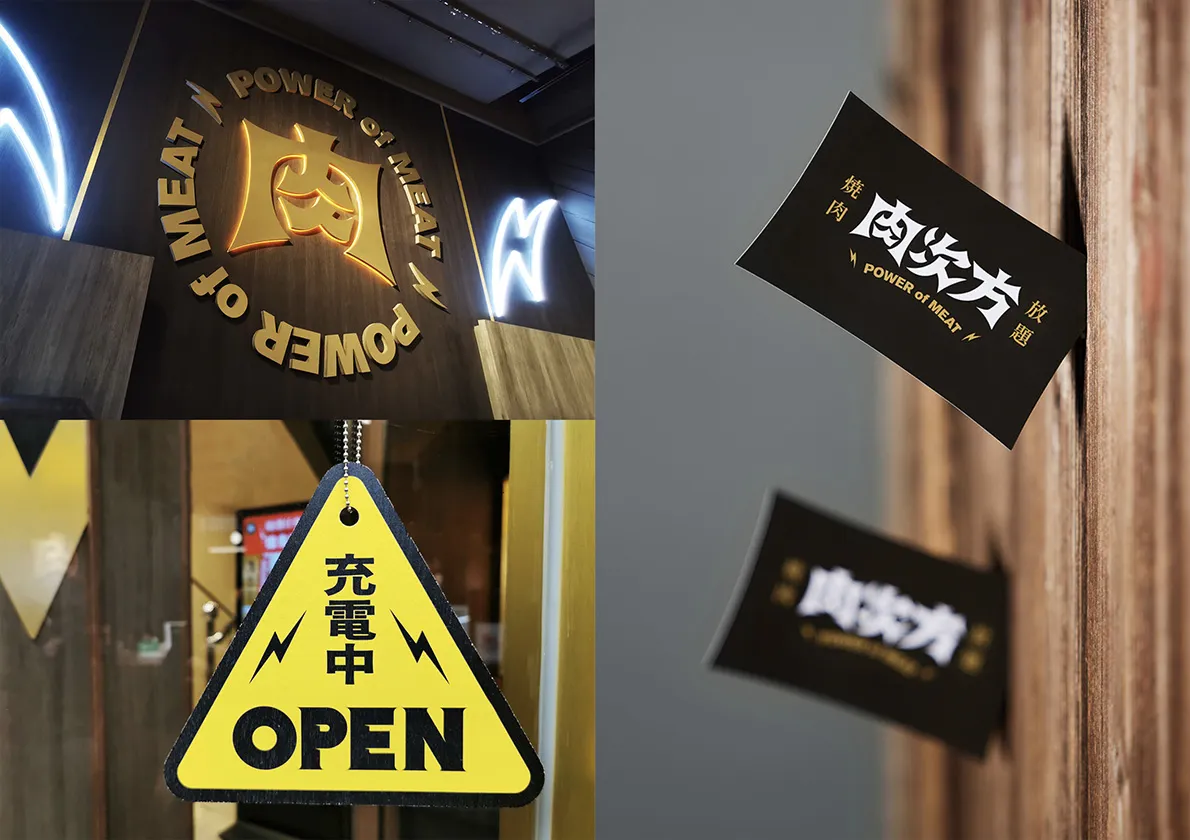
肉次方是一家充滿視覺與味覺體驗的日式燒肉店,各式無限供應的肉品與海鮮,滿足每一位無肉不歡的饕客。
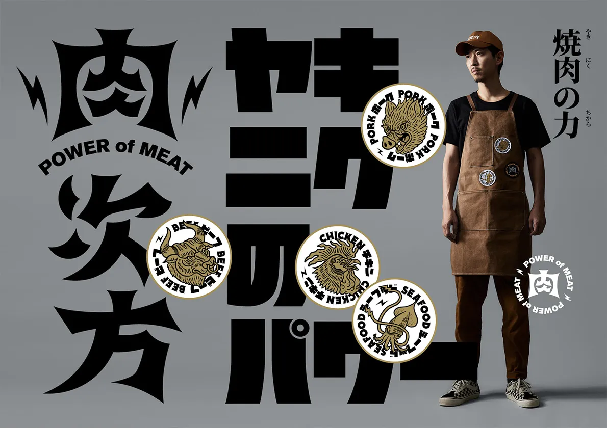
我們將肉食愛好者被肉滿足,將蛋白質轉化成能量的概念,以「用肉發電」為主軸,象徵能量如電力爆發,以電力符號為商標元素,貫穿商標、空間、菜單、銘牌與食器等延伸物。
爆破狀的標準字,有著擴張的視覺張力,更有著電力四射的視覺效果,黑與金的品牌色,呼應精緻的餐點品質與高級的用餐體驗。
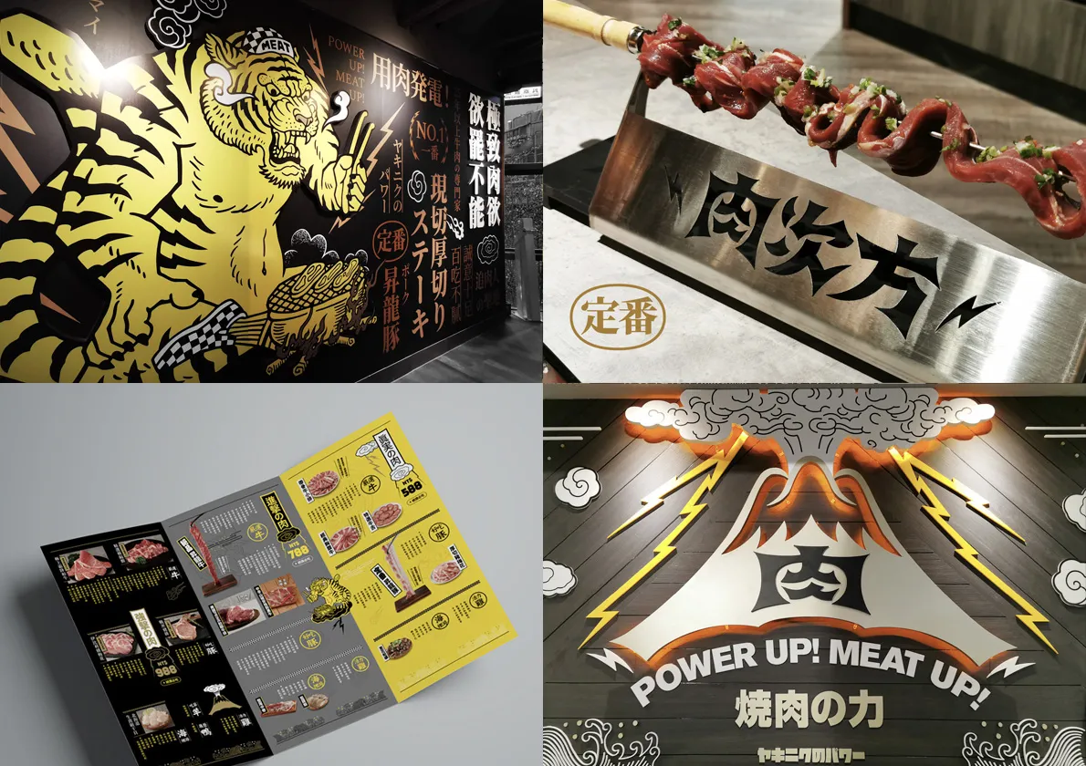
餐廳空間中,以細膩筆觸刻畫出富有生命力的牛、豬、雞與魷魚,與肉之火山的能量噴發,呈現於無法忽視的滿版牆面,凸顯食材的新鮮生猛與日式風格,讓食客不只味蕾上大快朵頤,視覺上更感受到強大燒肉之力的歡騰能量,擁有一頓豐沛的感官體驗。
Power of Meat is a yakiniku (Japanese barbecue) restaurant satisfying meat lovers with its flavorful all-you-can-eat meats, and a powerful visual experience that can't be neglected.
With the concept of meat power and converting protein into body energy, we transfer the restaurant into a power plant. The lightning symbol is used as a core element for all designs including logo, interior space, menu, nameplates, utensils, etc.
The puckered logotype expands the power of meat to a point of explosions that forms an energetic visual tension. To meet the meal's quality and pleasant dining experience, black and gold are chosen as the theme color.
We depict fresh meats (beef, pork, chicken and squid) as vigorous animals, along with an erupting volcano creating a strong visual impact on diners in the Japanese restaurant. The strong power of meat satisfies customers with not only flavors but a joyful and sensational dining experience.