臺灣國際海報設計獎|Taiwan International Poster Design Award
B類:非特定主題|Type B:Non-specific Topic
優選|Distinction
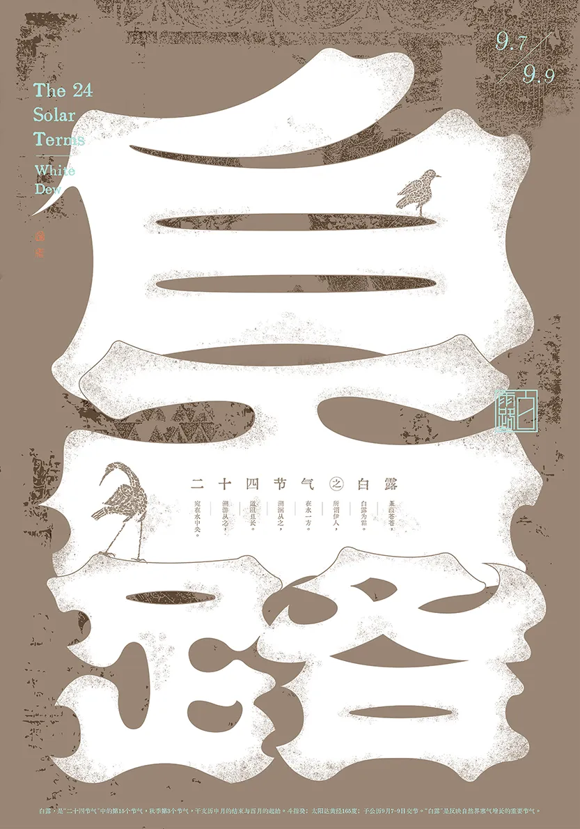
作品|Work:二十四節氣之白露
設計師|Designer:申飛 Fei Shen
國家/地區|Country/Region:中國大陸 China
作品說明|Description:
“白露”是反映自然界寒氣增長的重要節氣。畫面以文字設計作為媒介,以宋體字為骨架,融合了楷書和哥特體的某些造型特徵,文字邊緣的手工噪點質感增加了文字的體積感和空間感,加強了視覺張力,表現了節氣“白露”所獨有的一種蒼涼感。白色與灰色的主色設計,強化了“白露”的氣質,松石綠與胭脂色的局部元素點綴,則是增加了一絲生命活力,避免了畫面的沉悶。
“White dew”is an important solar term that reflects the growth of cold air in nature. The picture uses the character design as the medium, and the Song typeface as the skeleton. It combines some modeling features of regular script and Blackletter. The handmade noise at the edge of the text increases the volume and sense of space of the text, strengthens the visual tension, and shows a sense of desolation unique to the solar term "Bailu". The main color design of white and gray enhances the temperament of "Bai Lu", while the local elements of turquoise green and rouge add a touch of vitality and avoid the dullness of the picture.