臺灣國際企業識別設計獎|Taiwan International CI Design Award
C類:企業識別|Type C:Corporate Identity
優選|Distinction
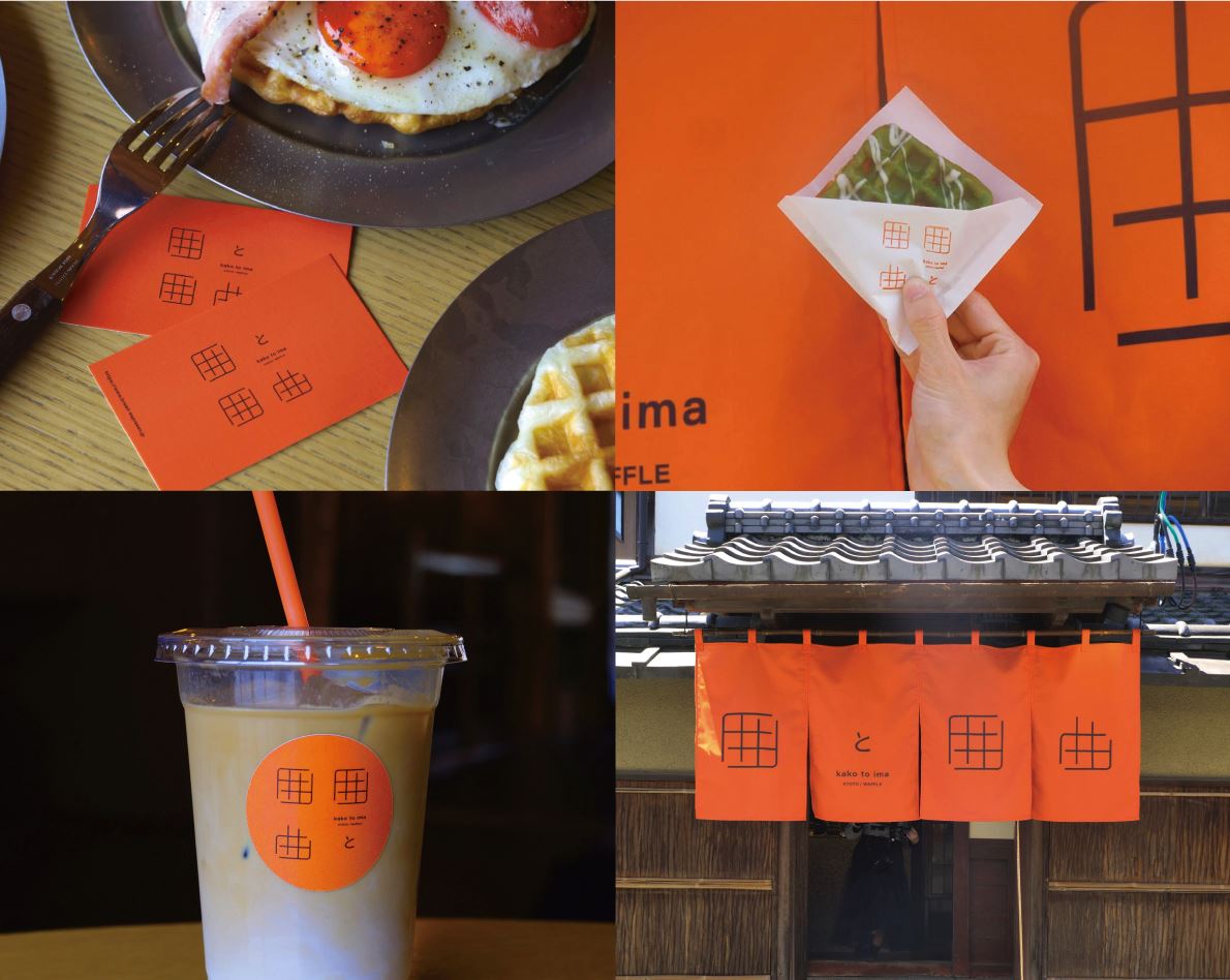
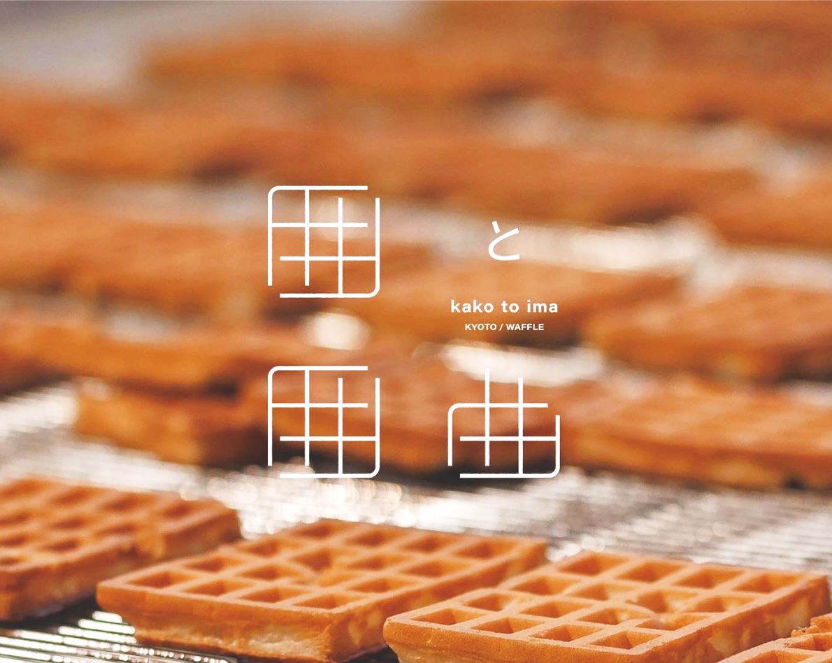
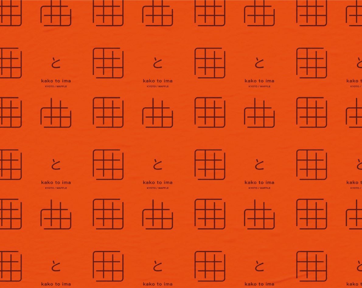
作品|Work:kako to ima
設計師|Designer:LEE GILTAE
國家/地區|Country/Region:日本 Japan
作品說明|Description:
This corporate identity was created for a waffle shop renovated from a traditional Kyoto townhouse. The name “Kako to ima” combines the Japanese characters 囲 and 囲曲, forming a new expression that symbolizes the connection between the past and the present. The logo design evokes both the form of the characters and the grid shape of waffles, linking the brand directly to its product. The color palette was carefully chosen to harmonize with Kyoto’s strict landscape regulations, ensuring cultural sensitivity while maintaining strong visual impact. Beyond its graphic function, the identity creates a welcoming atmosphere that allows visitors to experience the warmth of tradition and the freshness of modern life. By integrating traditional architecture, contemporary branding, and meaningful symbolism, the design presents the shop as a bridge between heritage and the present, inviting people to enjoy continuity, renewal, and an authentic sense of place.