臺灣國際海報設計獎|Taiwan International CI Design Award
C類:企業識別|Type C : Corporate Identity
優選|Distinction
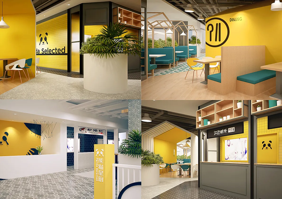
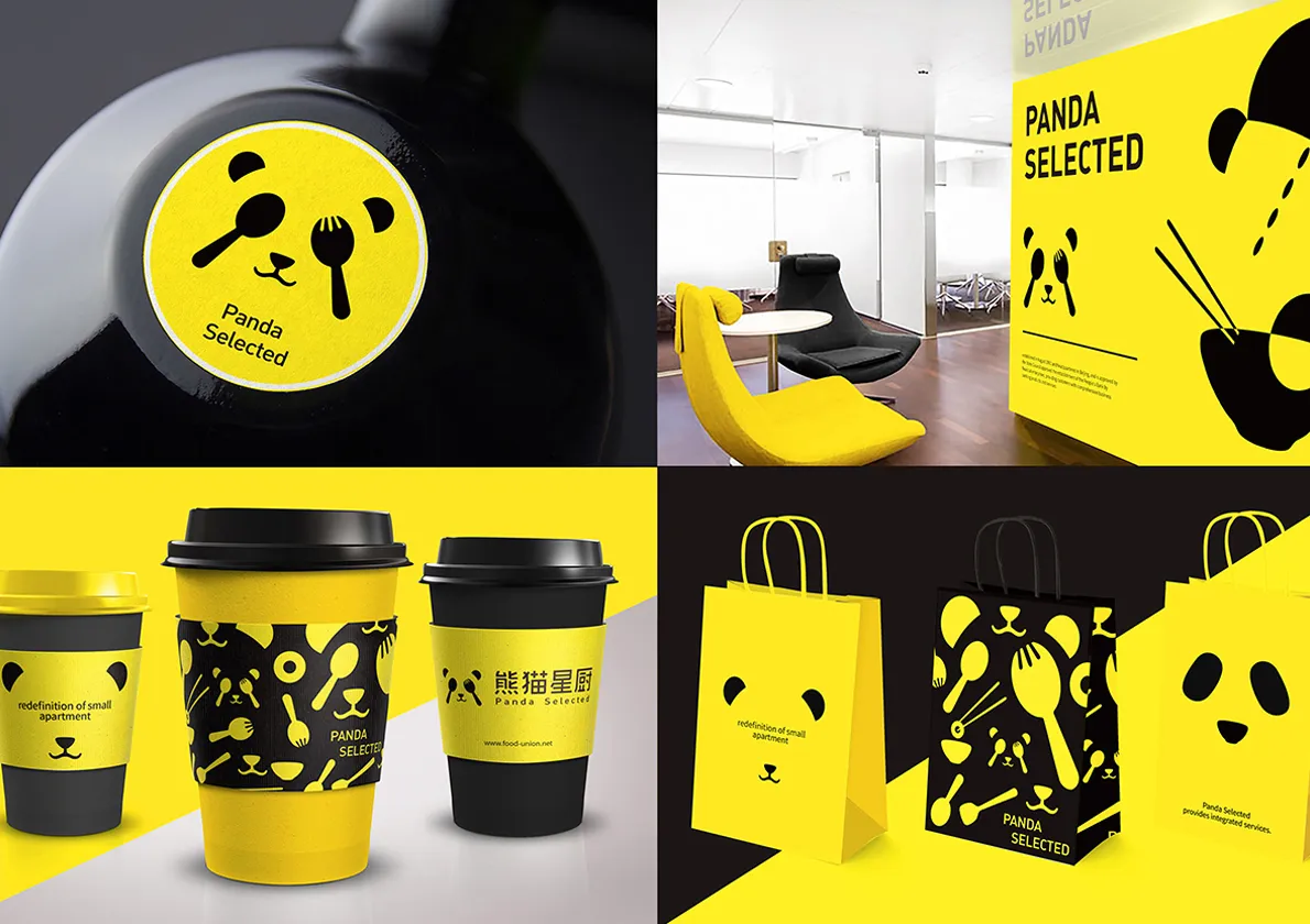
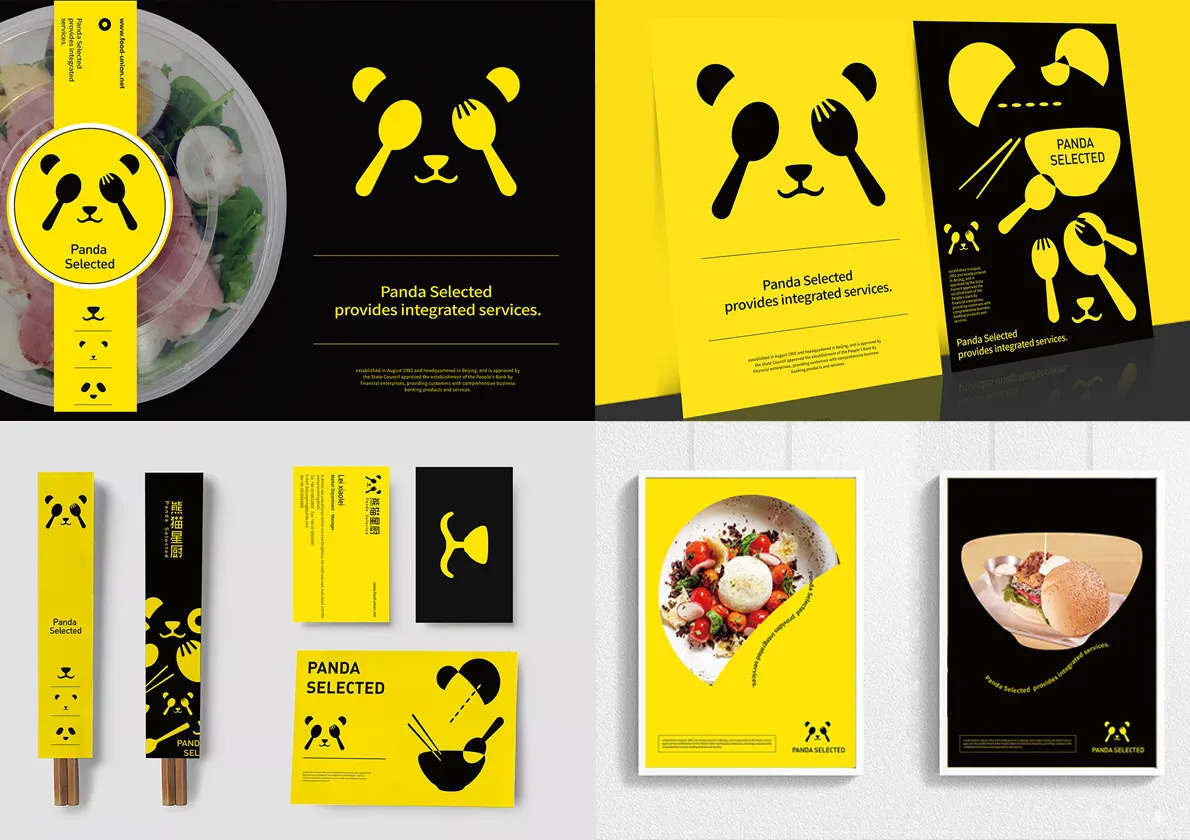
作品(Work): 熊猫星厨品牌形象升级设计
設計師(Designer): 陈厚
中國大陸|China
熊猫星厨是餐饮行业WeWork模式,致力于餐饮品牌孵化和场地运营服务,为餐饮商户提供厨房租赁、线上运营、市场推广等一体化解决方案,也有自己的堂食板块,目前已在深圳,上海,北京做商业布局;原logo方案已注册,文字和图形搭配传统,细节缺陷多,并没有完整的VI系统,otimebrand与理尚装饰合作,为熊猫星厨进行品牌诊断,品牌logo提升,品牌视觉整体规划设计,品牌室内空间设计全案服务。熊猫星厨logo过于琐碎,文字与标志的搭配不当,我们给其做了升级并规划了整个品牌形象系统,熊猫与餐厨元素的结合是视觉系统的核心,增强了熊猫画像,我们以此作为核心做延展,在色调上摒弃黑白的无色感,搭配黄色和黑色,让整个品牌视觉更加醒目,且有食欲感,室内空间结合VI的特点和元素,材质和软装的运用恰到好处。
Panda Selected is a WeWork model of catering industry, dedicated to catering brand incubation and site operation services, providing catering merchants with integrated solutions such as kitchen rental, online operation, market promotion, etc. It also has its own catering plate, which has been commercially laid out in Shenzhen, Shanghai and Beijing. The original logo scheme has been registered, with traditional text and graphics collocation, and many details are defective. With a complete VI system, we provide Panda Selected with brand diagnosis, brand logo promotion, brand visual overall planning and design, brand interior space design services. Panda Star Kitchen logo is too trivial, the text and logo are not matched properly. We upgraded and planned the whole brand image system. The combination of panda and kitchen elements is the core of the visual system, which enhances the panda portrait. We use this as the core to extend the panda image. We abandon the black and white colorless sense in tone, match yellow and black, so that the whole brand vision is more eye-catching and has. Appetite, the interior space combines the characteristics and elements of VI, and the use of materials and soft clothing is just right.